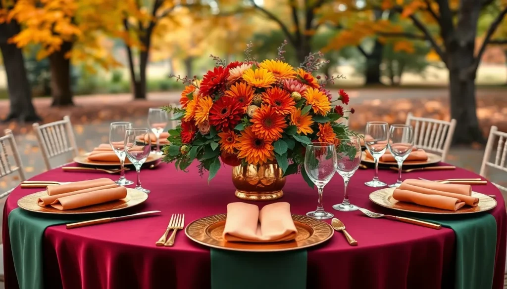
Fall weddings offer some of the most breathtaking color palettes nature has to offer. We’re talking about rich burgundies deep forest greens warm terracotta and golden amber hues that create an atmosphere no other season can match. These earthy tones don’t just look stunning in photos – they transform your entire celebration into a cozy romantic experience that guests will remember forever.
The magic happens when you embrace autumn’s natural beauty. We’ve seen couples struggle with choosing the perfect color scheme but fall makes it effortless. From burnt orange bridesmaid dresses to deep plum centerpieces the options are endless and naturally complement each other.
Whether you’re planning an outdoor ceremony surrounded by changing leaves or an intimate indoor reception we’ll show you how to harness fall’s most captivating colors. These aren’t just trending shades – they’re timeless choices that create warmth depth and sophistication in every wedding detail from invitations to table settings.
Classic Autumn Hues That Define Fall Wedding Elegance
These timeless fall colors create the foundation for sophisticated wedding palettes that never go out of style. We’ve selected the most elegant autumn shades that transform any venue into a romantic seasonal celebration.
Deep Burgundy and Wine Tones
Burgundy serves as the quintessential fall wedding color that instantly elevates any celebration’s sophistication. This rich hue works beautifully in bridesmaid dresses, table linens, and floral arrangements featuring dahlias and roses. Wine tones create depth when paired with cream or champagne accents in centerpieces and ceremony backdrops.
Incorporating burgundy through velvet ribbons, candles, and napkins adds luxurious texture to reception tables. Deep wine shades complement both indoor venues with exposed brick and outdoor settings surrounded by autumn foliage. Couples often choose burgundy for groomsmen ties and bouquet wrapping to create cohesive color flow throughout their wedding day.
Rich Burnt Orange and Copper Shades
Burnt orange captures autumn’s warmth while maintaining an elegant appearance in wedding decor and attire. This vibrant shade works exceptionally well in floral designs with marigolds, chrysanthemums, and orange roses. Copper accents through charger plates, vases, and metallic details enhance the richness of burnt orange elements.
Decorating with burnt orange pumpkins, persimmons, and seasonal gourds creates natural centerpieces that celebrate the harvest season. Orange bridesmaid dresses in chiffon or satin provide stunning contrast against outdoor ceremony backdrops. Copper lighting fixtures and candle holders reflect warmth throughout reception spaces when paired with these rich orange tones.
Golden Yellow and Amber Accents
Golden yellow brings sunshine warmth to fall wedding palettes while maintaining seasonal authenticity. This cheerful hue appears beautifully in sunflower arrangements, yellow roses, and autumn leaf garlands. Amber glass vases, votives, and string lights create magical ambiance for evening receptions.
Styling with golden yellow table runners, chair sashes, and ceremony petals adds brightness to darker autumn color schemes. Honey colored accents through wooden signs, escort cards, and favor boxes complement rustic wedding themes perfectly. Yellow and amber combinations work especially well for couples seeking fall colors that photograph beautifully in natural outdoor lighting.
Earthy Neutrals for a Sophisticated Fall Palette

We’ve found that earthy neutrals create the perfect foundation for sophisticated fall wedding palettes. These muted tones bring natural elegance to your celebration while maintaining timeless appeal.
Warm Taupe and Mushroom Gray
Warm taupe creates an incredibly sophisticated base color that evokes natural beauty and timeless elegance. We love how this versatile neutral pairs with autumnal elements like fallen leaves, pinecones, and rich wood textures. Mushroom gray adds depth to your color palette while maintaining that earthy sophistication that makes fall weddings so memorable.
These neutral tones work beautifully in bridesmaid dresses, table linens, and ceremony decor. Consider incorporating warm taupe in your floral arrangements as a grounding element between more vibrant fall blooms. Mushroom gray napkins or chair sashes create subtle elegance that won’t compete with your other wedding colors.
Creamy Ivory and Champagne Tones
Creamy ivory brings luxury and warmth to fall wedding celebrations without overwhelming your other color choices. We recommend balancing these soft hues with golden lighting or rich wood accents to create that perfect autumnal glow. Champagne tones add a touch of sparkle and sophistication that elevates your entire wedding aesthetic.
These colors shine in bridal attire, table settings, and floral arrangements. Ivory table runners paired with champagne candles create an elegant tablescape that feels both classic and seasonal. Consider champagne bridesmaid dresses that catch the light beautifully during golden hour photography sessions.
Soft Sage and Olive Green
Soft sage creates a calm and serene atmosphere that pairs perfectly with natural backdrops like forests or gardens. We’ve seen this muted green work wonderfully in both outdoor ceremonies and intimate indoor receptions. Olive green adds richness to your palette while maintaining that sophisticated earthy feel that defines elegant fall weddings.
These greens complement wooden ceremony arches, eucalyptus garlands, and natural stone venues beautifully. Sage green bridesmaids dresses create a stunning backdrop for autumn bouquets filled with seasonal blooms. Olive green accent pieces like napkins or ribbon details tie your entire color story together seamlessly.
Bold Jewel Tones That Capture Autumn’s Drama

Rich jewel tones transform fall weddings into luxurious celebrations that rival the season’s most dramatic moments. We’ve seen how these sophisticated colors create depth and elegance while complementing autumn’s natural beauty.
Emerald Green and Forest Hues
Emerald green creates a dramatic foundation for fall weddings that captures the vibrant colors of autumn foliage. We love pairing this bold jewel tone with earthy forest hues like moss and sage to establish a rich, natural atmosphere throughout your celebration.
Forest green bridesmaids dresses look stunning when combined with emerald green floral arrangements featuring eucalyptus and ferns. These deeper green tones work beautifully in table runners, napkins, and ceremony backdrops that reflect the season’s lush woodland settings.
Consider incorporating emerald green into your wedding stationery and invitations to set the tone from the beginning. We recommend using forest green accents in your centerpieces with natural elements like pinecones and branches to enhance the organic feel of your autumn celebration.
Sapphire Blue and Navy Depths
Sapphire blue adds sophisticated elegance to fall wedding palettes while creating stunning visual contrast with warmer autumn tones. We’ve found that navy depths provide the perfect backdrop for incorporating seasonal colors like terracotta and mustard yellow into your design.
Navy blue suits and ties create a classic look for grooms and groomsmen that complements the richness of fall. Sapphire blue bridesmaid dresses paired with warm floral bouquets featuring orange and gold blooms create a balanced and visually striking combination.
Deep blue table linens work beautifully with copper and gold accents in your centerpieces and place settings. We suggest using sapphire blue in your lighting design and candles to create an intimate atmosphere that enhances the drama of your evening celebration.
Amethyst Purple and Plum Accents
Amethyst purple brings regal sophistication to fall weddings while creating beautiful harmony with neutral autumn tones. We recommend pairing these deep purple hues with beige and taupe elements to achieve a refined autumnal palette that feels both luxurious and grounded.
Plum colored florals including dahlias and chrysanthemums create stunning bouquets and arrangements that capture the essence of late autumn. These rich purple tones work exceptionally well in velvet ribbons, bridesmaid accessories, and ceremony decor that adds texture and depth to your celebration.
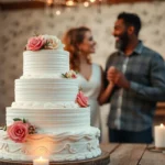
Amethyst accents in your cake design and dessert table create memorable focal points that tie your color scheme together beautifully. We love using plum colored candles and glassware to enhance the romantic ambiance while maintaining the sophisticated elegance that these jewel tones naturally provide.
Rustic Color Combinations Perfect for Outdoor Fall Ceremonies

Natural beauty and earthy tones define the essence of rustic fall weddings, creating perfect harmony with outdoor venues and woodland settings.
Dusty Rose and Mauve Pairings
Soft romance meets autumn elegance when we combine dusty rose and mauve in outdoor wedding palettes. These gentle hues create a sophisticated contrast to traditional bold autumn colors while maintaining the seasonal warmth couples desire.
Pairing possibilities expand when we blend dusty rose with deeper shades like navy or hunter green for dramatic depth. Neutral combinations work beautifully too, especially when we incorporate gray and ivory tones that complement natural outdoor backdrops.
Floral arrangements shine with dusty rose and mauve blooms, creating soft focal points against rustic wooden altars and ceremony arches. Bridesmaid dresses in these romantic shades photograph beautifully against fall foliage, while invitation suites featuring these colors set the perfect tone for intimate outdoor celebrations.
Terracotta and Rust Combinations
Warmth radiates from terracotta and rust color schemes that capture autumn’s earthiest essence perfectly. These rich, vibrant shades form the foundation for cohesive fall palettes that blend seamlessly with outdoor ceremony settings.
Deep reds and burnt oranges complement terracotta beautifully, while golden yellows add brightness to rust-based combinations. Together, these colors create visually striking arrangements that enhance natural woodland venues and rustic barn settings.
Bouquet designs flourish with terracotta and rust florals, especially when we incorporate seasonal blooms like dahlias and chrysanthemums. Table linens and décor elements in these warm tones create cozy reception atmospheres that guests remember long after the celebration ends.
Caramel and Bronze Blends
Sophisticated elegance emerges when we incorporate caramel and bronze into fall wedding color schemes. These refined metallic and warm neutral tones bring depth and luxury to outdoor ceremonies without overwhelming natural surroundings.
Metallic accents sparkle when we blend bronze with other warm metallics, creating layered visual interest in table settings and ceremonial details. Caramel tones pair seamlessly with deeper browns and creams, establishing rich foundations for rustic elegant themes.
Candle arrangements glow with bronze holders and caramel colored flames, creating romantic lighting for evening outdoor receptions. Table settings featuring these sophisticated shades enhance both rustic and elegant wedding styles, offering versatility that adapts to various outdoor venue types and celebration preferences.
Modern Fall Wedding Color Schemes with Contemporary Flair

Today’s couples are embracing innovative color combinations that blend autumn’s natural beauty with sleek, modern aesthetics. These contemporary palettes offer fresh alternatives to traditional fall wedding schemes while maintaining seasonal sophistication.
Blush Pink and Copper Metallics
Blush pink creates a romantic foundation when paired with the luxurious warmth of copper metallics. This sophisticated combination brings together soft femininity and industrial elegance for a truly modern fall aesthetic. Copper accents work beautifully in table settings, geometric centerpieces, and metallic candle holders that catch the light. Bridesmaids can wear blush pink dresses while groomsmen sport copper bow ties or pocket squares for cohesive styling. Wedding invitations featuring rose gold foil on blush cardstock set the tone from the very beginning.
The versatility of this palette allows for stunning floral arrangements mixing dusty pink roses with copper-toned chrysanthemums and eucalyptus. Ceremony arches draped in blush fabric with copper geometric backdrops create Instagram-worthy moments. Reception tables benefit from copper charger plates paired with blush napkins and rose gold flatware.
Slate Gray and Mustard Yellow
Slate gray provides an urban, contemporary base that perfectly complements the vibrant energy of mustard yellow. This bold pairing creates visual drama while maintaining sophisticated balance throughout your wedding design. Modern venues with industrial elements showcase this color scheme beautifully through exposed brick and metal fixtures. Groomsmen look sharp in slate gray suits while bridesmaids make a statement in flowing mustard yellow gowns.
Floral designers can incorporate this palette through yellow sunflowers, marigolds, and billy balls against gray dusty miller and silvery eucalyptus. Table runners in charcoal linen paired with bright yellow centerpieces create striking focal points. Stationery featuring slate gray backgrounds with mustard yellow typography adds contemporary flair to save-the-dates and programs.
Cream and Charcoal Sophistication
Cream serves as an elegant neutral foundation while charcoal accents provide modern depth and contrast. This timeless yet contemporary palette works exceptionally well for couples seeking understated luxury in their fall celebration. The combination offers flexibility for both indoor ballrooms and outdoor garden venues. Bridal gowns in ivory cream pair beautifully with charcoal gray groom attire for classic photographs.
Reception decor shines with cream table linens accented by charcoal napkins and dark gray glassware. Floral arrangements featuring cream roses, white hydrangeas, and gray-green foliage create sophisticated centerpieces. Lighting plays a crucial role in this palette, with warm Edison bulbs casting a romantic glow over cream and charcoal elements. Wedding cakes decorated in cream fondant with charcoal ribbon details complete this refined aesthetic.
Seasonal Flower Colors That Complement Fall Wedding Themes

Nature’s autumn palette offers an incredible array of flower colors that perfectly capture the season’s essence. We’ll explore the most stunning seasonal blooms that’ll transform your fall wedding into a breathtaking celebration.
Dahlia and Chrysanthemum Inspirations
Dahlias dominate fall flower arrangements with their spectacular color range spanning deep burgundy, burnt orange, golden yellow, and rich coral. These versatile blooms create stunning focal points in bridal bouquets and centerpieces while maintaining their vibrant hues throughout the season. Chrysanthemums bring symbolic meaning to fall weddings with their traditional association with joy and optimism. We love how these flowers complement autumn’s natural color story with shades of bronze, rust, deep purple, and warm cream. Both dahlia varieties and chrysanthemum types offer exceptional value since they’re readily available during fall months and maintain their beauty longer than many other seasonal options.
| Flower Type | Popular Fall Colors | Symbolism | Peak Season |
|---|---|---|---|
| Dahlias | Burgundy, burnt orange, coral, golden yellow | Elegance, dignity | September – October |
| Chrysanthemums | Bronze, rust, deep purple, cream | Joy, optimism | October – November |
Sunflower and Marigold Brightness
Sunflowers inject pure sunshine into fall wedding designs with their bold yellow petals and rich brown centers that echo autumn’s golden hour light. These cheerful blooms work beautifully in rustic and outdoor ceremonies while adding height and drama to floral installations. Marigolds contribute vibrant orange and deep yellow tones that complement the season’s harvest theme perfectly. We appreciate how both sunflower arrangements and marigold clusters create warmth against cooler autumn backdrops. Combining these bright blooms with deeper fall colors like burgundy or forest green creates stunning visual contrast that photographs beautifully.
Rose Hip and Berry Accents
Rose hips provide natural texture and rich red orange tones that add wild, organic beauty to fall wedding florals. These small fruits create excellent filler material in bouquets and centerpieces while offering a rustic charm that complements outdoor venues. Berry accents including hypericum berries, elderberries, and privet berries introduce deep purples, rich reds, and warm oranges to your floral palette. We find that rose hip details and berry clusters work exceptionally well as bridesmaid bouquet accents or ceremony aisle decorations. Both elements bring natural movement and seasonal authenticity to your wedding flowers while requiring minimal maintenance compared to traditional blooms.
Color Psychology Tips for Choosing Your Perfect Fall Palette

Understanding how colors affect emotions and atmosphere becomes crucial when planning your fall wedding celebration. We’ll explore the psychological principles that make certain color combinations create the perfect ambiance for your special day.
Creating Warmth and Intimacy
Warm colors like orange and burgundy naturally evoke feelings of coziness and closeness among wedding guests. These hues trigger psychological responses that make spaces feel more intimate and welcoming, transforming any venue into a romantic sanctuary. Orange tones stimulate conversation and create energy, while burgundy adds sophistication and depth to your celebration.
Deep reds and rich browns work together to establish emotional connections between your guests and the celebration itself. Psychology research shows that warm colors reduce perceived distance between people, making your wedding feel more personal and meaningful. Incorporating wine inspired colors like magenta creates an atmosphere of luxury and refinement that encourages guests to relax and enjoy themselves.
Golden amber and terracotta shades bring a sense of comfort that mirrors the feeling of gathering around a warm fireplace. These colors psychologically represent security and togetherness, essential elements for creating lasting wedding memories. Choosing warm palettes helps establish the emotional foundation your celebration needs to feel truly special.
Balancing Bold and Subtle Tones
Combining bold colors with subtle neutrals prevents visual overwhelm while maintaining visual interest throughout your wedding design. Pairing vibrant oranges with creamy ivory creates contrast without competition, allowing each color to enhance the other’s beauty. This balance ensures your guests can appreciate the full spectrum of your chosen palette without feeling overstimulated.
Subtle neutrals like taupe and champagne serve as grounding elements that allow bolder colors to shine without dominating the space. These neutral tones provide visual rest areas that help guests process and appreciate the more dramatic elements of your design. Strategic placement of bold accents against neutral backgrounds creates focal points that guide attention naturally.
Emerald green paired with lighter shades like pink or tangerine demonstrates how contrasting intensities work together harmoniously. The key lies in using the 60-30-10 rule: 60% neutral base, 30% secondary color, and 10% bold accent to maintain visual balance. This proportion ensures your color palette feels intentional rather than chaotic.
Considering Venue and Lighting Effects
Natural lighting dramatically affects how your chosen colors appear throughout different times of day during your celebration. Morning ceremonies showcase cooler tones beautifully, while afternoon receptions enhance warm colors like burgundy and gold with natural sunlight. Evening celebrations benefit from deeper, richer colors that maintain their vibrancy under artificial lighting.
Indoor venues with warm lighting enhance orange and red tones while potentially washing out cooler colors like blues and purples. Fluorescent lighting can make warm colors appear harsh, so consider how your venue’s existing lighting will interact with your chosen palette. Testing color samples in your actual venue at different times helps you make informed decisions.
Outdoor settings present unique challenges as lighting changes throughout your celebration from ceremony to reception. Colors that look stunning in golden hour light may appear completely different under string lights or lanterns later in the evening. Planning your color transitions to work with natural lighting changes ensures your palette remains beautiful throughout your entire celebration.
Conclusion
Fall weddings offer an incredible canvas of colors that naturally complement each other and create unforgettable celebrations. We’ve explored everything from classic burgundies and burnt oranges to modern palettes that blend contemporary style with autumn’s natural beauty.
The key to success lies in understanding how these colors work together and considering factors like venue lighting and seasonal flowers. Whether you’re drawn to bold jewel tones or prefer subtle earthy neutrals your fall wedding palette should reflect your personal style while embracing the season’s inherent warmth.
Remember that autumn’s natural backdrop provides the perfect foundation for any color scheme you choose. Trust your instincts test your colors in your actual venue and don’t be afraid to mix traditional fall hues with unexpected modern touches for a truly personalized celebration.
Frequently Asked Questions
What are the most popular fall wedding colors?
The most popular fall wedding colors include rich burgundy, deep wine tones, burnt orange, copper, golden yellow, amber, warm taupe, and mushroom gray. These classic autumn hues create sophisticated palettes that capture the season’s natural beauty. Jewel tones like emerald green, sapphire blue, and amethyst purple are also trending for dramatic fall celebrations.
How do I choose the right color palette for my fall wedding?
Consider your venue, lighting conditions, and personal style when selecting colors. Test color samples at your actual venue during different times of day to see how lighting affects them. Balance bold autumn tones with neutral colors to prevent visual overwhelm, and incorporate both warm and cool tones for depth and sophistication.
Can I use modern colors for a fall wedding instead of traditional autumn hues?
Absolutely! Modern fall wedding palettes include blush pink with copper metallics, slate gray with mustard yellow, or cream and charcoal combinations. These contemporary schemes blend autumn’s natural beauty with modern aesthetics, creating stylish celebrations that feel fresh while still honoring the season’s essence.
What flowers work best with fall wedding color schemes?
Popular fall wedding flowers include dahlias in burgundy and golden yellow, chrysanthemums in warm tones, sunflowers, and marigolds. Rose hips and berry accents add organic texture and rich seasonal colors. These blooms naturally complement autumn palettes and enhance the overall seasonal aesthetic of your celebration.
How can I incorporate fall colors into my wedding decor?
Use your chosen palette in bridesmaid dresses, table linens, floral arrangements, and lighting. Incorporate colors through table runners, centerpieces, candles, and ceremony backdrops. For outdoor weddings, let natural autumn foliage serve as a backdrop while adding pops of your chosen colors through decor details.
Are earthy neutrals suitable for elegant fall weddings?
Yes, earthy neutrals like warm taupe, mushroom gray, creamy ivory, and champagne create sophisticated foundations for fall weddings. These versatile tones evoke natural elegance and pair beautifully with bolder autumn colors. They’re perfect for creating refined, timeless celebrations that feel both seasonal and sophisticated.
How do jewel tones work in fall wedding palettes?
Jewel tones like emerald green, sapphire blue, and amethyst purple add drama and luxury to fall weddings. They create striking contrasts with traditional autumn colors and work beautifully with metallic accents. These rich colors are perfect for couples wanting bold, regal celebrations that capture autumn’s dramatic beauty.
What rustic color combinations work for outdoor fall ceremonies?
Dusty rose and mauve create soft romance, while terracotta and rust combinations radiate warmth perfect for rustic venues. Caramel and bronze blends add depth and luxury to woodland settings. These earthy combinations harmonize naturally with outdoor autumn backdrops and enhance the organic beauty of fall ceremonies.