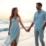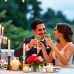
Planning your dream wedding involves countless details and wedding flyers play a crucial role in setting the tone for your special day. Whether you’re announcing your engagement, sharing save-the-date information, or promoting your wedding-related events, well-designed flyers create lasting first impressions that reflect your unique love story.
We understand that creating stunning wedding flyers can feel overwhelming with so many design possibilities to consider. From elegant minimalist layouts to bold romantic themes, the right design elements can transform a simple announcement into a cherished keepsake that your guests will treasure long after your celebration ends.
Our comprehensive guide explores innovative wedding flyer design ideas that’ll help you create beautiful, professional-looking invitations without breaking your budget. We’ll share creative layouts, color schemes, typography choices, and design trends that make your wedding announcements stand out while perfectly capturing your personal style and wedding theme.
Classic Elegance Wedding Flyer Design Ideas
Classic elegance never goes out of style, making it a perfect choice for couples who want their wedding flyers to feel timeless and sophisticated. These design approaches create invitations that guests will treasure for years to come.
Timeless Typography and Serif Fonts
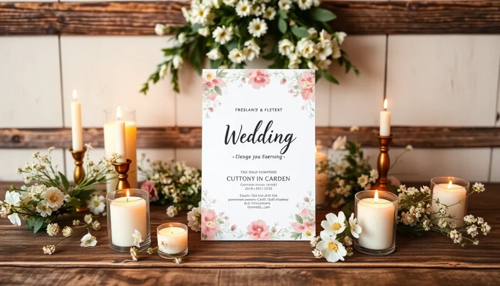
Serif fonts establish the foundation of classic wedding flyer design with their traditional appeal and refined character. We recommend using fonts like Times New Roman, Garamond, or Baskerville for your main text to create that sophisticated look couples love. Script fonts work beautifully for names and romantic phrases, with options like Edwardian Script or Brush Script adding personal touches to your announcements.
Typography hierarchy plays a crucial role in classic designs, where we typically see the couple’s names featured in larger serif fonts at 24-28 points. Wedding details follow in smaller serif text around 12-14 points, maintaining readability while preserving that elegant aesthetic. Line spacing should remain generous at 1.5 to 2 times the font size to give your text room to breathe.
Letter spacing adjustments can transform ordinary serif fonts into extraordinary design elements. We suggest increasing the spacing by 10-15% for headings and keeping body text at standard spacing for optimal readability. This technique creates visual interest while maintaining the classic feel your wedding flyer needs.
Neutral Color Palettes with Gold Accents
Neutral color schemes provide the perfect backdrop for classic wedding flyers, with combinations like cream and gold, ivory and rose gold, or soft gray and champagne creating timeless appeal. We’ve found that these palettes work exceptionally well because they photograph beautifully and complement most wedding themes seamlessly.
Gold accents serve as the perfect enhancement to neutral bases, whether you choose metallic gold foil, printed gold ink, or digital gold effects. Border elements, divider lines, and decorative flourishes benefit from gold treatments that catch the light and add luxury to your design. We recommend limiting gold usage to 10-15% of your total design area for maximum impact.
Color temperature consistency ensures your classic palette remains cohesive throughout your wedding flyer design. Warm neutrals like cream, champagne, and soft beige pair beautifully with warm gold tones, while cool neutrals such as dove gray and pearl white complement cooler metallic accents like platinum or silver.
Traditional Border Elements and Frames
Ornate borders establish the classic foundation that makes wedding flyers feel special and formal. We suggest incorporating Victorian-inspired scrollwork, Art Deco geometric patterns, or simple double-line frames to create visual boundaries that enhance your content. These elements work particularly well when they’re sized proportionally to your flyer dimensions.
Frame thickness should vary based on your overall design complexity, with thin borders (1-2 points) working best for detailed backgrounds and thicker frames (3-5 points) complementing simpler layouts. Corner flourishes add extra elegance, especially when they incorporate small botanical elements like roses or leaves that tie into your wedding theme.
Symmetrical designs create the balanced look that defines classic elegance, where we mirror decorative elements on both sides of your flyer for visual harmony. This approach works exceptionally well with centered text layouts and formal photography placement. Pattern consistency throughout your border elements ensures your wedding flyer maintains its sophisticated appearance from top to bottom.
Modern Minimalist Wedding Flyer Concepts

We’re shifting from traditional elegance to embrace the contemporary beauty of minimalist design that creates sophisticated wedding flyers through strategic simplicity.
Clean Lines and White Space Usage
We use ample white space as our primary design element to create that clean and sophisticated look that modern couples crave. Strategic placement of white space helps focus attention on essential details like your names and wedding date without overwhelming guests with visual noise.
Our approach centers on maintaining breathing room around each design element to ensure maximum impact. Visual hierarchy becomes naturally apparent when we allow generous spacing between text blocks and imagery.
We recommend leaving at least 30% of your flyer design as white space to achieve that truly minimalist aesthetic. Empty areas don’t represent wasted space but rather purposeful design choices that enhance readability and create visual calm.
Sans-Serif Typography Combinations
We prefer sans-serif fonts for their modern and sleek appearance that perfectly complements minimalist wedding themes. Combining different sans-serif fonts adds visual interest without cluttering your design or competing with other elements.
Our typography strategy involves pairing a bold sans-serif for headings with a lighter weight version for body text. Weight variations within the same font family create natural hierarchy while maintaining design consistency throughout your flyer.
We suggest limiting yourself to two sans-serif fonts maximum to prevent visual confusion. Popular combinations include pairing Helvetica with Futura or mixing Montserrat with Source Sans Pro for contemporary appeal.
Geometric Shapes and Contemporary Layouts
We incorporate geometric shapes such as triangles, circles, and hexagons to add modern touches without overwhelming the minimalist foundation. These elements serve as subtle accents that guide the eye through your wedding information naturally.
Contemporary layouts often involve asymmetrical arrangements that break traditional wedding invitation rules. Creative use of negative space allows us to position text and imagery in unexpected yet pleasing configurations.
Our geometric approach includes using simple shapes as frames for photos or as dividers between text sections. Subtle geometric patterns can also create texture without adding visual weight to your overall design.
Rustic and Vintage Wedding Flyer Inspirations

Moving away from sleek minimalism, we’re exploring designs that celebrate warmth and timeless charm through carefully curated vintage elements.
Distressed Textures and Weathered Backgrounds
Distressed wood surfaces create an authentic rustic foundation for wedding flyers that immediately transport guests to a countryside celebration. We recommend incorporating weathered barn wood textures, aged fence panels, or reclaimed lumber patterns as your primary background elements. Vintage paper textures work exceptionally well when you want to evoke the feeling of handwritten love letters or family heirlooms passed down through generations.
Worn fabric backgrounds add softness while maintaining that coveted vintage aesthetic. Consider using burlap, aged linen, or vintage lace patterns to create depth without overwhelming your wedding details. These textural elements photograph beautifully and create natural contrast zones for your typography.
Combining multiple distressed elements requires careful balance to avoid visual chaos. We suggest using one dominant texture as your base, then layering subtle secondary textures at 20-30% opacity to maintain readability while achieving that perfectly imperfect vintage look.
Hand-Lettered Fonts and Script Typography
Handwritten fonts bridge the gap between rustic charm and elegant sophistication in ways that standard typefaces simply can’t achieve. Script typography adds personality to your wedding announcements while maintaining the intimate feel that vintage designs require. Popular choices include brush lettering styles that mimic hand-painted signage or delicate calligraphy fonts that reference historical wedding documents.
Mixing script weights creates visual hierarchy without sacrificing the cohesive vintage aesthetic. We recommend pairing flowing script fonts for names and dates with simpler serif fonts for venue information and RSVP details. This combination ensures readability while preserving that handcrafted appeal.
Custom lettering elements can transform ordinary wedding information into artistic focal points. Consider incorporating hand-drawn flourishes, decorative swashes, or vintage-inspired ampersands that complement your chosen script fonts and reinforce the handmade quality of your design.
Natural Elements and Botanical Illustrations
Botanical illustrations bring organic beauty to rustic wedding flyers while connecting your design to nature-inspired celebrations. Wildflowers, eucalyptus branches, and vintage-style roses work particularly well when rendered in muted tones that complement weathered backgrounds. These natural elements can frame important information or create decorative borders that guide the eye through your wedding details.
Seasonal flora choices reflect your wedding timing and location preferences. Spring designs benefit from delicate cherry blossoms or peonies, while autumn celebrations call for maple leaves, wheat stalks, or dried flowers that echo harvest season aesthetics. Winter rustic designs can incorporate pine branches, holly, or dried lavender for sophisticated seasonal appeal.
Layering botanical elements at varying opacities creates depth without overwhelming your text content. We suggest using larger floral illustrations as subtle background elements at 15-25% opacity, then incorporating smaller botanical accents at full opacity as decorative borders or corner flourishes to maintain visual balance throughout your wedding flyer design.
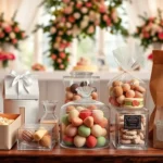
Floral and Garden-Themed Wedding Flyer Designs

Garden themed wedding flyers bring natural romance to your celebration announcements. These designs center around images of flowers, greenery, and garden landscapes to create an elegant and inviting atmosphere.
Watercolor Flower Arrangements
Watercolor techniques offer a gentle artistic touch that’s perfect for romantic wedding announcements. We recommend incorporating hand-painted or digitally rendered watercolor blooms in soft shades to achieve that light, airy effect that guests love. These designs typically feature delicate florals as backgrounds, creating depth without overwhelming your wedding details.
Blending colors naturally through watercolor methods makes your flyer feel more personal and handcrafted. Soft pinks, lavenders, and cream tones work beautifully together in watercolor arrangements. Position your wedding text over lighter areas of the watercolor background to ensure readability while maintaining that artistic flair.
Botanical Line Art and Illustrations
Botanical line art brings modern sophistication to garden themed wedding flyers through intricate plant illustrations. These designs often feature flowers, leaves, and vines rendered in black and white or subtle colors for a minimalistic yet elegant approach. We suggest using botanical illustrations as border elements or corner accents to frame your wedding information effectively.
Combining detailed line work with clean typography creates visual balance that highlights your wedding details. Simple botanical motifs like eucalyptus branches or delicate flower stems can guide the eye through your flyer layout. These illustrations add classic charm while keeping the design readable and professional looking.
Nature-Inspired Color Schemes
Nature inspired color palettes create serene and cohesive looks that complement garden themes perfectly. We recommend using soft greens, blush pinks, sky blues, and earthy tones to evoke natural beauty and romance. These colors work together harmoniously whether you’re creating minimalist designs or more elaborate floral arrangements.
Earthy tones like sage green and dusty rose photograph beautifully and appeal to couples seeking organic wedding aesthetics. Incorporating these nature inspired hues as backgrounds or accent colors helps draw attention to important wedding information while maintaining that garden party feel. Neutral bases with pops of botanical colors create stunning visual impact without overwhelming your guests.
Destination Wedding Flyer Design Approaches

We’ve explored elegant and romantic themes, but destination weddings require a completely different design strategy that captures both location and celebration. These specialized flyers need to transport guests to your chosen venue before they even board a plane.
Location-Exact Imagery and Landmarks
Incorporating iconic landmarks transforms ordinary wedding flyers into captivating travel invitations. Beach weddings benefit from sunset imagery and palm tree silhouettes that immediately establish the tropical setting. Mountain venues call for majestic peak outlines or forest landscapes that convey the natural grandeur guests will experience.
Scenic views create emotional connections between your celebration and the destination’s unique beauty. Coastal ceremonies shine with ocean horizons and sandy shorelines featured prominently in the background design. Urban destinations work perfectly with city skylines or architectural elements that define the location’s character.
Cultural symbols add authenticity and help guests understand the local atmosphere they’ll encounter. Mediterranean venues pair beautifully with olive branches and ancient column illustrations. Asian destinations benefit from traditional patterns or architectural motifs that honor the location’s heritage.
Travel-Themed Graphics and Icons
Airplane graphics immediately signal the adventure aspect of destination celebrations. Small aircraft silhouettes work well as decorative elements around wedding details. Vintage plane illustrations add a romantic travel aesthetic that appeals to couples planning classic destination ceremonies.
Passport stamps and travel documents create excitement about the upcoming journey. We recommend incorporating subtle passport-style borders or vintage luggage tag shapes as design frames. Travel visa graphics can serve as unique background elements that reinforce the international celebration theme.
Luggage tags function as both decorative elements and practical information organizers. These travel icons work perfectly as containers for important wedding details like ceremony times or reception locations. Suitcase illustrations can frame RSVP information while maintaining the travel theme throughout the design.
Cultural Elements and Regional Motifs
Local cultural patterns add depth and respect to destination wedding announcements. Traditional fabric designs from the wedding location create authentic background textures that honor regional artistry. Geometric patterns exact to the area work beautifully as border elements or corner decorations.
Architectural elements showcase the destination’s unique building styles and historical significance. Moroccan arch shapes complement desert venue celebrations perfectly. Greek column details enhance Mediterranean island wedding announcements with classical elegance.
Regional motifs connect your celebration to local traditions and customs. Celtic knots suit Irish castle weddings while maintaining romantic symbolism. Tropical destinations benefit from native flower patterns or traditional weaving designs that guests will recognize upon arrival.
Luxury and Glamorous Wedding Flyer Styles

Luxury wedding flyers elevate your celebration announcements beyond ordinary invitations. These sophisticated designs transform simple event details into stunning keepsakes that reflect the grandeur of your special day.
Metallic Foil Effects and Shimmer Elements
Metallic foil accents instantly transform wedding flyers into premium announcements that catch the light beautifully. Gold foil remains the most popular choice for luxury wedding invitations, while silver and rose gold options offer modern alternatives that photograph exceptionally well. Apply foil effects strategically to key elements like names, dates, or decorative borders rather than covering entire sections.
Shimmer elements work best when used sparingly throughout your design composition. Consider incorporating subtle metallic touches in floral illustrations or geometric patterns to create visual interest without overwhelming the text. Layer different metallic tones to achieve depth and sophistication in your wedding flyer design.
High-End Typography and Elegant Spacing
Typography selection defines the luxury aesthetic of your wedding flyer more than any other design element. Serif fonts like Trajan Pro or Optima convey timeless elegance, while carefully chosen script fonts add romantic sophistication to ceremony details. Combine two complementary typefaces maximum to maintain visual hierarchy and professional appearance.
Generous white space creates breathing room that premium designs require for maximum impact. Allow at least 40% of your flyer space to remain uncluttered, focusing attention on essential wedding information. Increase line spacing by 1.5 times normal text settings to enhance readability and create that coveted high end feel.
Rich Color Combinations and Premium Textures
Sophisticated color palettes distinguish luxury wedding flyers from standard invitation designs immediately. Navy blue paired with gold accents creates timeless elegance, while emerald green combined with cream offers a fresh yet refined approach. Deep burgundy and rose gold combinations photograph beautifully and work well across different lighting conditions.
Premium texture elements add tactile luxury that guests notice and remember long after your wedding day. Incorporate subtle velvet or satin texture overlays digitally to create visual richness without compromising text readability. Layer textures sparingly behind design elements rather than across entire flyer surfaces to maintain professional polish.
Beach and Coastal Wedding Flyer Ideas

Beach wedding flyers transport guests to paradise before they even arrive at your celebration. Creating coastal themed designs captures the romance of oceanside ceremonies while reflecting the relaxed elegance of seaside celebrations.
Ocean-Inspired Color Palettes
Soft blues and whites create the perfect foundation for beach wedding flyers that mirror sea foam and sky horizons. We recommend using these calming shades as your primary color scheme since they photograph beautifully and evoke the tranquil atmosphere of coastal ceremonies. Pair powder blue with crisp white typography to achieve a fresh, airy aesthetic that guests will immediately associate with ocean breezes.
Turquoise and coral combinations bring tropical warmth to your wedding announcements through vibrant coastal tones. These colors work exceptionally well for destination beach weddings or summer celebrations where you want to emphasize the fun, vacation like atmosphere. Use turquoise as your dominant color with coral accents for text highlights or decorative elements.
Sea greens and sandy neutrals offer an earthy alternative that blends seamlessly with natural beach environments. Sage green paired with warm beige or cream creates a sophisticated palette that works for both casual beach ceremonies and upscale coastal venues. This combination photographs well in both digital and print formats while maintaining readability across all design elements.
Nautical Elements and Maritime Graphics
Anchors and ropes serve as classic nautical symbols that instantly communicate your maritime theme while adding adventure to your design. Incorporate these elements as subtle border details or use them to frame important wedding information like ceremony times and venue addresses. Position anchor graphics strategically to guide the eye through your flyer without overwhelming the text content.
Lighthouses and ships create iconic maritime visuals that evoke exploration and journey themes perfect for couples beginning their adventure together. Use lighthouse silhouettes as background elements or incorporate vintage ship illustrations as corner accents. These graphics work particularly well when rendered in monochromatic styles that complement your chosen color palette.
Seagulls and fish add whimsical touches that bring playful energy to formal wedding announcements. Scatter small seagull silhouettes across your design or use stylized fish graphics as decorative borders. Keep these elements subtle to maintain the elegant feel while adding personality that reflects your fun loving approach to your beach celebration.
Sandy Textures and Tropical Motifs
Sandy textures transform ordinary wedding flyers into tactile experiences that mimic the actual feel of beach sand. Digital texture overlays create depth and visual interest while maintaining print quality across different paper types. Apply these textures as background elements or use them to highlight exact sections of your wedding information.
Palm trees and hibiscus flowers symbolize tropical paradise and create instant recognition for beach themed celebrations. Position palm tree silhouettes along the edges of your flyer or use hibiscus blooms as accent pieces around your text blocks. These botanical elements work best when rendered in complementary colors that enhance rather than compete with your primary palette.
Seashells and starfish bring authentic ocean treasures to your design while adding whimsical beachy appeal. Scatter small shell graphics throughout your layout or use larger starfish illustrations as focal points. PosterMyWall and Canva offer customizable templates featuring these elements, making it easy to incorporate professional quality beach motifs into your wedding flyer designs.
DIY Wedding Flyer Design Tips and Tricks

Creating stunning wedding flyers doesn’t require professional design skills or expensive software. We’ll explore accessible tools and techniques that help transform your wedding vision into beautiful, print-ready announcements.
Budget-Friendly Design Software Options
Canva leads our list of affordable design platforms with its user-friendly drag-and-drop functionality. Free templates provide excellent starting points, while premium options offer advanced features for just $12.99 monthly. The platform includes wedding-exact templates with customizable elements like fonts, colors, and images.
PosterMyWall delivers an extensive library of free and customizable wedding flyer templates. We recommend this platform for couples seeking variety without budget constraints. The software supports high-resolution downloads and provides templates for different wedding themes including rustic, modern, and elegant styles.
Adobe Express offers free wedding flyer templates with intuitive customization options. Professional-grade tools become accessible through simple interfaces, making complex design tasks manageable for beginners. The platform integrates seamlessly with other Adobe products for enhanced workflow efficiency.
GIMP serves as a powerful free alternative to expensive photo editing software. Advanced users appreciate its comprehensive editing capabilities, while newcomers benefit from extensive online tutorials. The open-source nature ensures continuous updates and community support.
Template Customization Strategies
Personalizing fonts and colors transforms generic templates into unique wedding announcements. We suggest selecting two complementary fonts: one for headers and another for body text. Color schemes should reflect your wedding theme, with 2-3 primary colors creating visual harmony throughout the design.
Inserting personal photos adds intimate touches that distinguish your flyers from standard templates. High-resolution engagement photos work exceptionally well as background elements or focal points. We recommend using photos with good lighting and minimal background distractions for optimal printing results.
Adjusting layouts accommodates your exact information while maintaining visual balance. Text hierarchy guides readers through essential details like date, time, location, and RSVP information. Generous white space prevents overcrowding and enhances readability across different age groups.
Incorporating meaningful elements personalizes templates beyond basic customization. Wedding venues, favorite flowers, or cultural symbols create deeper connections with recipients. These elements should complement rather than compete with essential wedding information.
Print-Ready File Preparation Guidelines
Resolution requirements ensure crisp, professional-looking printed flyers. We always set our designs to 300 DPI minimum for clear text and sharp images. Lower resolutions create pixelated results that diminish the perceived quality of your wedding announcements.
File format selection impacts printing quality and compatibility across different printers. PDF format provides the most reliable results, preserving fonts, colors, and layout integrity. JPEG works for simple designs but may compress text clarity in complex layouts.
Color mode specifications prevent disappointing color mismatches between screen and printed versions. CMYK color mode accurately reproduces colors during professional printing, while RGB mode suits digital sharing only. We recommend converting designs to CMYK before final printing to ensure color accuracy.
Bleed addition eliminates unsightly white edges that appear after paper cutting. Standard bleed measures 0.125 inches extend beyond the final trim size. This extra margin ensures your design reaches the paper’s edge, creating a professional finished appearance that rivals commercially printed invitations.
Typography Best Practices for Wedding Flyers

Typography serves as the foundation of effective wedding flyer design, transforming simple text into elegant visual communication. We’ll explore professional techniques that ensure your wedding announcements capture attention while maintaining perfect readability.
Font Pairing Techniques and Combinations
Contrasting combinations create the most ever-changing and sophisticated wedding flyer designs. We recommend pairing bold sans-serif fonts with elegant script typefaces to highlight couple names and essential event details effectively. Clean geometric fonts work beautifully alongside flowing calligraphy styles, creating visual interest without overwhelming the design.
Consistency matters throughout your entire wedding stationery suite for a cohesive brand experience. We suggest selecting two to three complementary fonts maximum, then using them consistently across save-the-dates, invitations, programs, and thank-you cards. This approach creates professional polish while avoiding the chaos that multiple font families can introduce.
Successful pairings we’ve seen include Montserrat Bold with Amatic SC for modern celebrations, or Times New Roman with Great Vibes for traditional ceremonies. These combinations provide the perfect balance between contemporary appeal and classic elegance that today’s couples desire.
Hierarchy and Readability Considerations
Visual hierarchy guides guests through your wedding information in logical order using strategic font variations. We recommend making couple names the largest text element, followed by ceremony date and time, then venue details and RSVP information in descending size order. This creates a natural reading flow that ensures critical details get noticed first.
Font sizing should follow the 60-30-10 rule for optimal readability. We suggest using 60% of your text in the primary readable size, 30% for secondary information, and 10% for accent details like website URLs or dress codes. This proportion maintains visual balance while ensuring all information remains accessible.
Legibility requirements demand careful attention to font selection and spacing. We always test our chosen fonts at actual print size to verify readability, especially for script fonts that can become unclear when reduced. Adequate line spacing and letter spacing prevent text from appearing cramped or difficult to read.
Script Fonts vs. Display Fonts Usage
Script fonts excel at adding personal elegance and romantic appeal to wedding flyers, particularly for traditional or vintage-themed celebrations. We recommend using script typography for couple names, ceremony titles, or decorative elements that enhance the emotional connection. Popular script choices include Dancing Script, Pacifico, and Sacramento for their beautiful flow and readability.
Display fonts work perfectly for modern and contemporary wedding themes, offering bold minimalist appeal that photographs beautifully. We suggest incorporating display typography for venue names, dates, or call-to-action elements that need strong visual impact. Clean display fonts like Oswald, Bebas Neue, or Raleway create sleek sophistication.
Strategic application involves using script fonts sparingly to maintain readability while maximizing visual impact. We recommend limiting script usage to 20% of your total text content, reserving it for the most important emotional elements like couple names or ceremony descriptions. This approach ensures your wedding flyer remains both beautiful and functional for all guests.
Color Psychology in Wedding Flyer Design

Color choices profoundly influence how guests perceive your wedding celebration before they even arrive. Understanding color psychology empowers couples to create flyers that evoke the perfect emotions and set expectations for their special day.
Emotional Impact of Different Color Schemes
Warm colors like red and orange stimulate excitement and energy, making them perfect for lively celebrations and evening receptions. Red signifies passion and love, creating an atmosphere of romance and intensity that guests will anticipate from your wedding festivities. Orange radiates warmth and enthusiasm, encouraging a joyful and welcoming feeling among your invitees.
Cool colors such as blue and green create a sense of calmness and trust, making them ideal for more formal wedding events and daytime ceremonies. Blue conveys trust and calmness, establishing a serene foundation that suggests an elegant and peaceful celebration. Green represents growth and tranquility, symbolizing new beginnings and the fresh start of married life together.
Pastel colors offer soft and romantic appeal, delivering a gentle emotional impact that’s perfect for vintage or whimsical wedding themes. These delicate hues create an dreamy atmosphere that suggests intimacy and tenderness throughout your celebration.
Seasonal Color Palette Selections
Spring weddings flourish with pastels and soft colors like peach and mint, capturing the season’s renewal and fresh blooming energy. These gentle tones reflect the natural awakening of spring flowers and create anticipation for outdoor ceremonies and garden receptions.
Summer celebrations thrive with bright colors such as coral and yellow, delivering a vibrant feel that matches the season’s high energy and abundant sunshine. Bold summer palettes communicate fun and festivity, perfect for beach weddings or outdoor evening parties.
Autumn ceremonies embrace earthy tones like burgundy and gold, providing warmth that complements the season’s rich natural beauty. These deeper colors suggest cozy gatherings and harvest celebrations, creating an inviting atmosphere for fall wedding festivities.
Winter weddings shine with ice blues and silvers, establishing a frosty ambiance that captures the season’s crystalline elegance. Cool winter palettes evoke sophistication and create expectations for formal indoor celebrations with sparkling details.
Cultural Significance of Wedding Colors
White maintains traditional significance in Western weddings but represents mourning in some Eastern cultures, requiring careful consideration when designing flyers for diverse guest lists. Understanding these cultural nuances ensures your color choices respect all attendees’ backgrounds and create inclusive celebration announcements.
Cultural color meanings vary significantly across different traditions, making research essential when planning multicultural weddings or when guest lists include international family members. Consulting with family elders or cultural advisors helps ensure your flyer colors communicate the intended message to all guests.
Regional color preferences influence guest expectations, so incorporating culturally appropriate hues demonstrates respect and thoughtfulness in your wedding planning approach. Balancing personal style with cultural sensitivity creates flyers that honor traditions while reflecting your unique love story.
Conclusion
We’ve explored countless design possibilities that can transform your wedding flyers from simple announcements into treasured keepsakes. Whether you’re drawn to classic elegance or modern minimalism each style offers unique ways to reflect your personality and celebration theme.
The key to successful wedding flyer design lies in understanding your vision and choosing elements that work harmoniously together. From typography and color psychology to cultural considerations and budget-friendly tools we’ve covered everything you need to create stunning invitations.
Remember that your wedding flyer sets the tone for your entire celebration. With the design ideas and practical tips we’ve shared you’re now equipped to create beautiful announcements that will excite your guests and capture the essence of your special day.
Frequently Asked Questions
What are the key benefits of using wedding flyers for my celebration?
Wedding flyers serve multiple purposes in your wedding planning process. They help announce your engagement, share save-the-date information, and promote wedding events to guests. The right design transforms a simple announcement into a cherished keepsake that reflects your personal style and wedding theme while staying within budget.
What design style should I choose for my wedding flyer?
Your design style should reflect your wedding theme and personal preferences. Popular options include classic elegance with serif fonts and gold accents, modern minimalist designs with clean lines and white space, rustic vintage styles with distressed textures, or floral garden themes with watercolor elements and botanical illustrations.
What are the best color schemes for wedding flyers?
Effective color schemes depend on your wedding style. Classic designs work well with neutral palettes and gold accents, while modern styles benefit from monochromatic schemes. Rustic themes suit earthy tones, floral designs shine with soft greens and blush pinks, and luxury styles excel with rich combinations like navy and gold.
How can I create professional-looking wedding flyers on a budget?
Use budget-friendly design software like Canva, PosterMyWall, or Adobe Express, which offer wedding-specific templates. Customize these templates by changing fonts, colors, and adding personal elements. Focus on good typography, strategic use of white space, and ensure your files are print-ready with proper resolution and bleed settings.
What typography best practices should I follow for wedding flyers?
Limit yourself to 2-3 complementary fonts maximum. Establish a clear visual hierarchy with larger fonts for names and dates, medium fonts for venue information, and smaller fonts for additional details. Pair script fonts with clean sans-serif or serif fonts for optimal readability while maintaining visual appeal.
How do I prepare my wedding flyer files for printing?
Ensure your design has a minimum 300 DPI resolution for crisp printing. Save files in CMYK color mode rather than RGB for accurate color reproduction. Add 0.125-inch bleed around all edges and include crop marks. Choose appropriate file formats like PDF or high-resolution JPEG for professional printing results.
What elements should I include in a destination wedding flyer?
Incorporate location-specific imagery like landmarks or scenic views, travel-themed graphics such as airplane silhouettes or passport stamps, and cultural elements that reflect the destination. Use color schemes that evoke the location’s atmosphere, whether tropical blues for beach destinations or warm earth tones for desert locations.
How does color psychology affect wedding flyer design?
Colors influence emotions and perceptions. Warm colors like red and orange create excitement and energy, while cool colors like blue and green evoke calmness and tranquility. Consider seasonal appropriateness, cultural significance, and your wedding’s overall mood when selecting your color palette to ensure it resonates with your guests.